A New Identity for a Global Association
Context
Legal Netlink Alliance (LNA) is a global association of independent small and medium law firms, with members in 35 countries across Europe, Asia, and the Americas. A dynamic and modern organization, it provides members and their clients access to top-tier legal representation worldwide.
The Challenge
LNA needed a new visual identity that aligns with the organization’s core values and its level of development.
The Solution
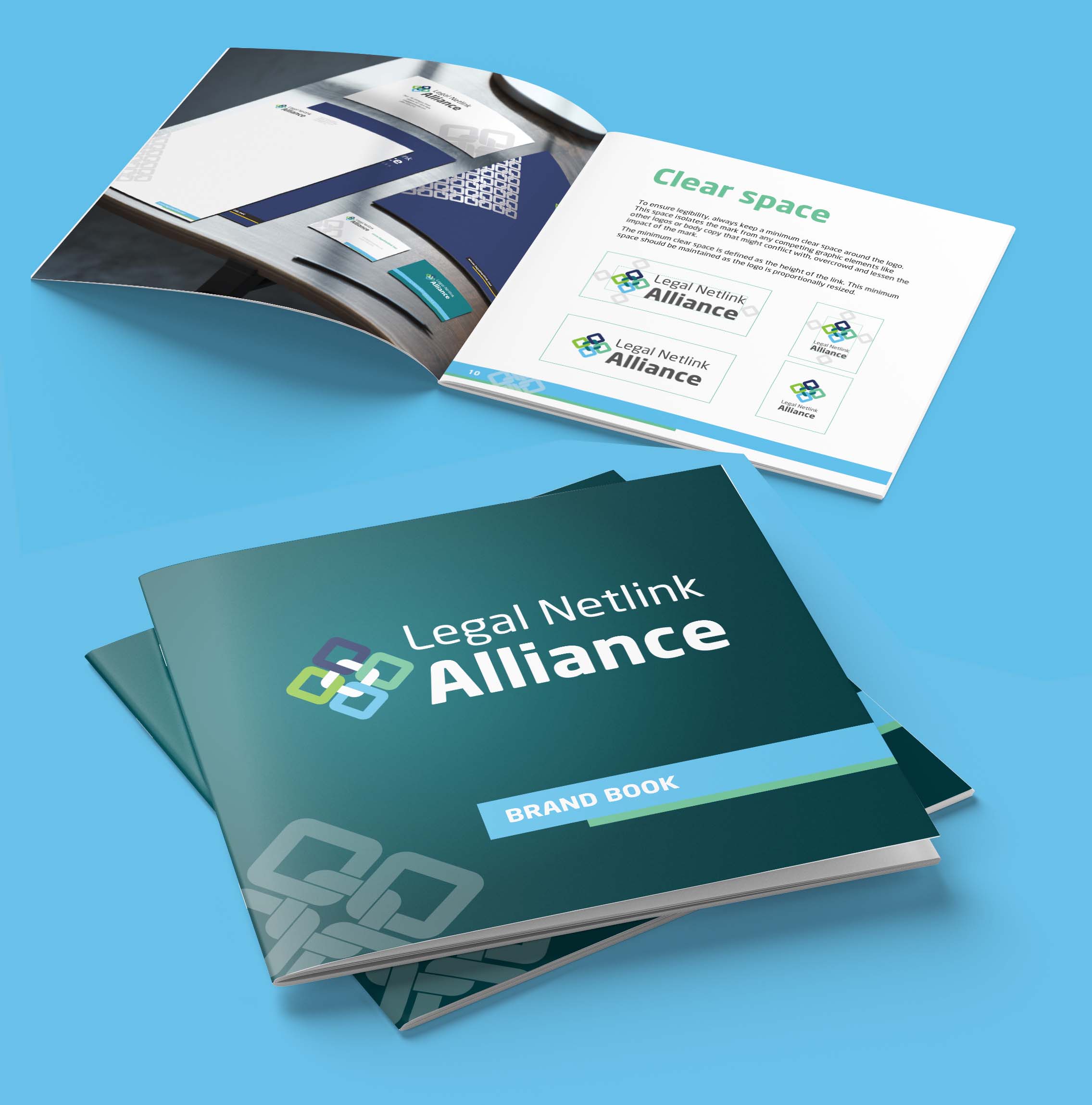
The decision to collaborate with Arena came after a pitch, where our proposed solutions convinced the LNA board. We created a modern identity and an elegant website that represent the association and its position in the legal world.
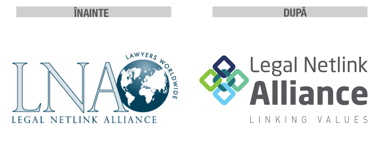
 The Legal Netlink Alliance icon consists of four interconnected links held together by a fifth one. All links have the same shape, but each is a different color.
The chain links symbolize the alliance partners—all equal, connected, and stronger together.
We chose a color palette based on blue (seriousness, business) and green (nature, freshness). Dark shades dominate, alternating with vibrant, youthful tones. The Neo Sans font is modern and sans-serif, using an elegant dark gray shade that visually balances the graphic symbol.
We extended the visual identity to a dynamic and intuitive website—a platform that successfully represents the organization in the digital space. With the new identity, Legal Netlink Alliance reaffirms its strong position in the legal world and its role as a connector among its members.
Services: Visual identity design, brandbook, website